Arguably one of the most challenging tasks as a designer is branding oneself; that means how you design your portfolio, both online and PDF. Do you keep both consistent with each other? Are you active on Social Media, and if so, in what capacity? Do you have a logo? Do you market yourself with a personality-led approach, or stripped back and almost-anonymous as the Swiss designers do? What projects should you include? Do you include work that you’ve already done to get more work or show work that you want to do but haven’t done yet? Should you write your bio in the first or third person? Should you discuss the processes of a project? Show sketches? Photo? Date of Birth? On what platform should you publish your work? Cargo-Collective? Indexhibit? Squarespace? I’ve tried every platform within my reach and have redesigned my website a dozen times by now.
The quest to produce the perfect portfolio never really ends. With an industry that is as fast-paced and trend-driven as design is, you’re continuously grappling with wanting to stick with the craft you’ve studied, what you enjoy and what will ultimately make you (just enough) money. My case against personal branding for designers lies in the belief that your work should largely speak for itself, and that you should allow yourself the flexibility to work on different things that might not necessarily make sense together in a portfolio.
My first professional website was image-based; the branding and advertising work I produced at the time followed a “Pop” and “Clean” trend (think Google rebrand and Circular-era AirBnB), so my portfolio was also clean and colourful. This back then made my website look relatively uniform in a quirky sort of way. However, during my MA studies, my work took on a much darker tone (depressed really! but dark sounds sexier). I’d become more interested in art history and design theory; namely perfecting my *ArtHeaux persona, which meant not being afraid of producing “ugly” and thinking more deeply about the role that design played in the wider social and political realm.
After some time, my design styles clashed; you could see it in the way that photos of my book projects on white capitalist institutions didn’t make sense next to a luxurious 300,000 m² shopping mall I’d created for a Russian retail company. I would then try to Photoshop these separate works to make them fit with each other, art-working my projects with scenes from MrMockUp or attempting to strip my branding projects from their contexts by creating logo-folios. It was all such a bother and took more time than it should have. After taking my site offline to position myself properly, I realised after a long time that I didn’t want to position or brand myself at all.
My experiences range from designing and proofreading Autism Spectrum books in London to creating TV show screen credits for a cooking competition in Bern. I’ve always maintained that the design process was more interesting to me than the end result, so to have based my professional persona on various end results didn’t make sense to me anymore. I realised quite quickly how much I was not a brand, thus I did not want to be in a position to “sell” myself. Instead, I wanted to create a space where I could talk through all the work I’d produced without reducing myself to a single aesthetic. With this in mind, I designed this website, with usability and function at the forefront.
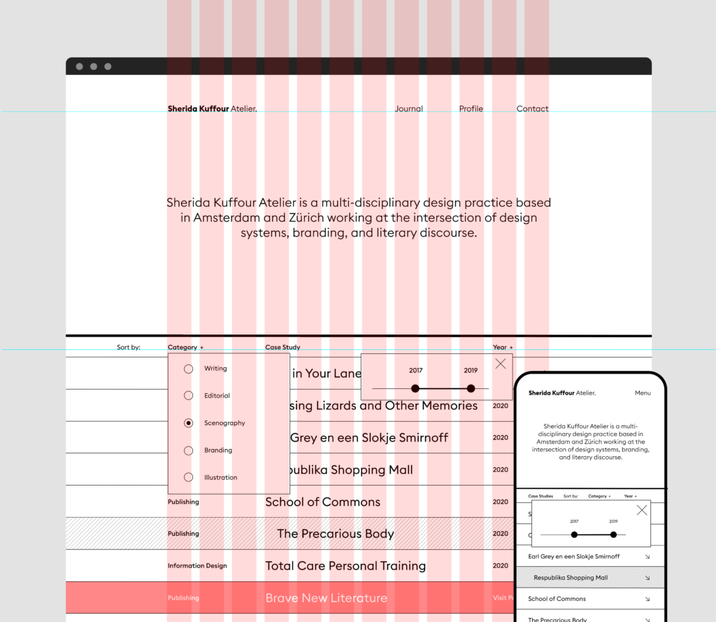
I thought of the idea of a TV index or even a Yell book and how it can go for as long as need be whilst hosting a variety of content. In terms of usability, different people come to me for different types of design, and it is important to me that those people can directly engage with the kind of work they’re looking for. This is how the filter and sort functions came to be, both on my blog and on my main website. It allows me to not choose between the different disciplines that I exist in, instead allowing each work to breathe independently.
The accordion function on the homepage is so that its environment fundamentally binds the projects, simple layouts with edge-to-edge imagery means that I am no longer designing a page anytime I upload a project, which is incredibly freeing. Seeing my work online as just a professional synopsis rather than a “brand” liberates me from a lot of anxiety. I’ve created a personalised index that is simple in function and aesthetic and that will be ever-expanding as I expound into other areas of design and beyond. Except for maybe reconsidering a different typeface in a few years, I’m never redesigning this shit again! This website was a labour of both the heart and mind, and I hope that anyone who visits my website now can get a greater feel of me and what possibilities of collaboration could look like.
*Pointedly not an ArtHeaux/hoe/ho—unfortunately. Recommended reading https://www.diggitmagazine.com/articles/whitewashing-art-hoe-movement
